Imperfectionism
This post was titled "Perfectionism" but was cursed by its own name. Like saying "Beetlejuice" three times, the idea for a post about perfectionism caused me to suffer under its peculiar burden.
The good news is that after a week of struggle under this exacting beast, I have come away with some insights into what perfectionism is and how it manifests in my life.
TL;DR. Perfectionism is actually really, really great and healthy, you should do it, and here is how.
How to succeed as a perfectionist: writing a blog post #
The way you complete a post about perfectionism is first to begin creating your design system.
Start choosing a color palette for the site. Create a design token file to export them into CSS variables. Continually rename and refactor the structure of the design token object. Make sure you choose the right colors for a dark and light theme. Make lighter and darker variations of the main colors. Test color combinations for accessibility against the light and dark background. Research the not yet implemented color contrast calculations which more closely match human perception than current WCAG luminance-based formulas.
Choose a "brand" color. Should you style the links in the brand color? Keep on changing the colors of the different parts of the page and tweaking the HSL color values. Wish that changing the lightness value worked the same for all colors. Get tired and go to sleep.
Continue messing with color until you are tired and must sleep, you run out of time, or you start a new aspect of your journey not to write the blog post. Maybe something to do with typography...
Notice that your typeface text-underline looks awful. Choose a new typeface. Create font stacks for serif, sans-serif, and monospace fonts. Consider performance, but decide for that you can afford one web font. Go for Garamond. Or is that too old fashioned? Set up your vertical rhythm based on Garamond's line height for body text. Choose the heading fonts and set their line heights. Make sure you are enshrining all of these decisions in your design tokens. Should you use fluid type — clamp, and vw values? Or are the risks of breaking zoom too high? Sleep and forget about the blog post for a few days.
Research every choice. Google "should links be brand colors". Open many, many tabs. It's way too late - get to bed.
Start writing the post. Realize you need to look up what perfectionism is. Begin some more research. Do you need footnotes? Can markdown do footnotes?
Research footnotes for 11ty. Get tired.
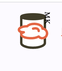
Edit logo svg by hand. Optimize it so it couldn't be smaller. Add classes to the parts and integrate with color system. Should you use brand1 for the cloud in the logo? Add an animation so the cloud slides across the sky in front of the cylinder. Add your initials using an svg text element and then to make it seem to curve around the face of the can, wrap it in a textPath. Spend 4 hours learning about textPath and get your initials just right so they appear when the cloud moves away from the cylinder...in Firefox. Open it in Chrome and you get this:
...
Revisit decisions, re-research the best practices. Rinse and repeat.
How to succeed as an imperfectionist. #
This is how you complete a post about imperfectionism.
Release Notes #
- Many style tweaks
- Implement a design token system
- Refactor old logo and add animation
- Change date style